Project Overview
Phorest Salon Software is a SaaS solution for salon owners to run their entire business, offering features like appointment management, POS, marketing, and more. However, the core product's 15-year-old codebase suffered from tech debt, and multiple design iterations had led to inconsistencies. This hindered innovation, limited our ability to deliver a modern experience, and created user confusion.
To address this, we embarked on a strategic initiative to upgrade the foundational codebase and simultaneously align a unified design language. This will streamline development, create a seamless user experience, and enhance the overall usability of our platform.
The state of the product UI
The product's UI reflected different development stages. Legacy Swing components clashed visually and functionally with newer iframe web screens, creating a fragmented experience.
Business Pain Point & Needs
As a Business we faced a multi-faceted challenge: our legacy Swing platform demanded manual updates, burdened development with old code maintenance, and presented an outdated, inconsistent user interface.
- Releases were slower and required clients to update software, which they often didn’t
- Bottle necks with very few developers to work on the old tech stack, time consuming to update.
- Dated design impacted new sign ons and contributed to churn.
- Little to no documentation or unified design system, unclear for designers what components to use and when.
- Inefficiencies in processes and technology hindered our ability to scale our company and reach our target of 15,000 salons.
This hampered our 'scale without strain' growth strategy. To address this, we needed to migrate to a modern web technology stack, streamline development processes, align a cohesive user interface, and establish robust design systems. These changes would free up resources, enhance product appeal, and accelerate our innovation capabilities.
Customer Pain Point & Needs
The Issues weren't only business related, the migration would aim to fix customer issues too.
- Inconsistent designs led to a host of usability issues - different patterns for similar actions
- On-boarding new staff in salons was time consuming due to unintuitive interface
- Siloed information, requiring multiple steps to complete certain tasks
- They weren't getting the latest releases when they didn't update their app
- Accessibility Issues in the designs of the buttons and Icons
Users demand a platform that is intuitive, consistent, and provides seamless access to relevant information. The UI must be easy to learn to facilitate staff onboarding, accessible to all, and consistently updated to provide the most up-to-date experience.
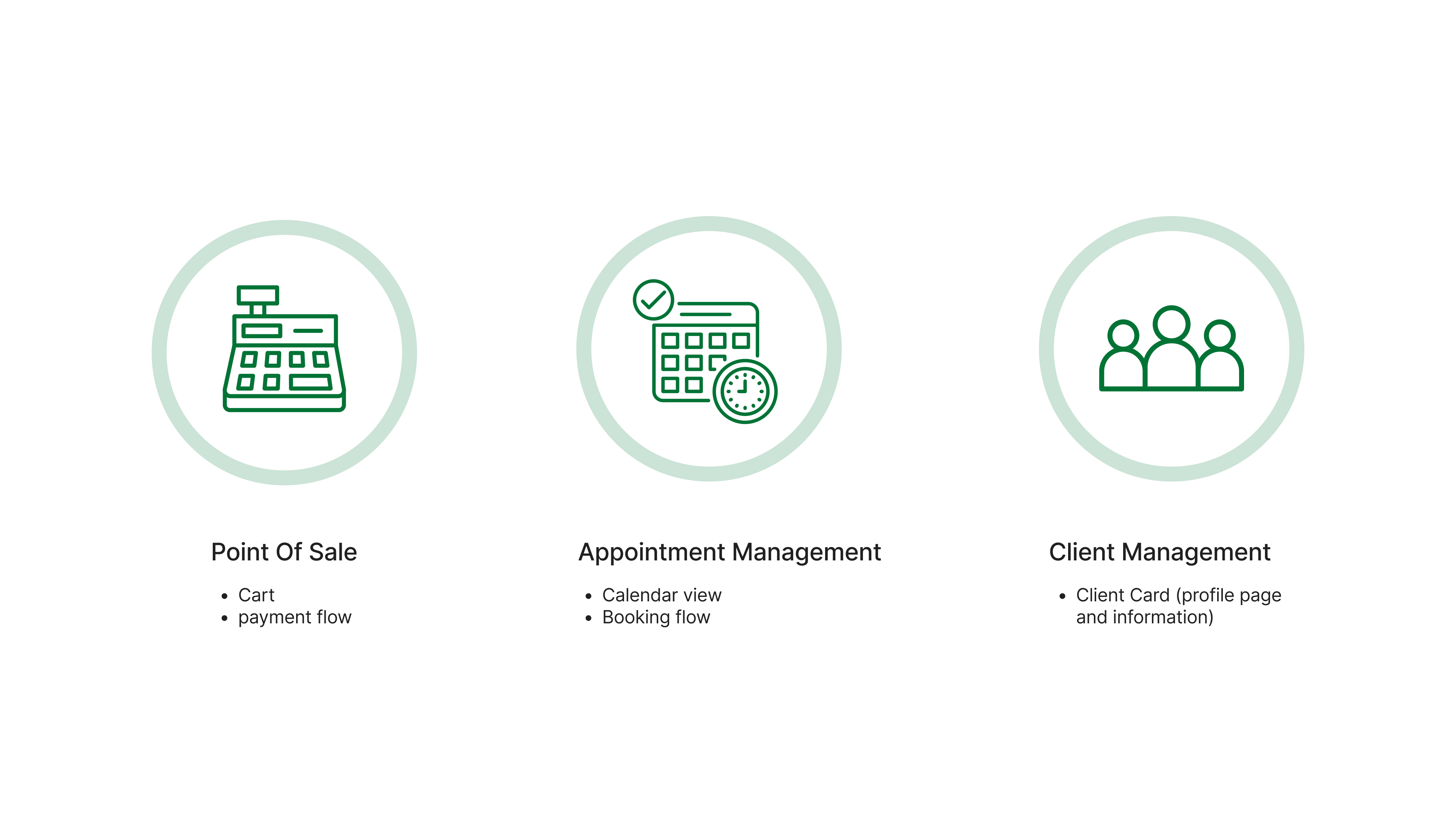
Defining the Scope
Our strategic goal was to deprecate the legacy Swing technology and fully migrate to a web-based architecture for scalable growth. Recognising the complexity of Phorest's comprehensive salon management suite (booking, POS, marketing, etc.), we prioritised the most impactful migration.
To deliver maximum value, we focused on the 20% of the product that drives 80% of usage. Research identified this high-impact area as the "front of house" – encompassing core salon operations and customer interactions. This targeted approach would create a foundation for success in our broader migration efforts.
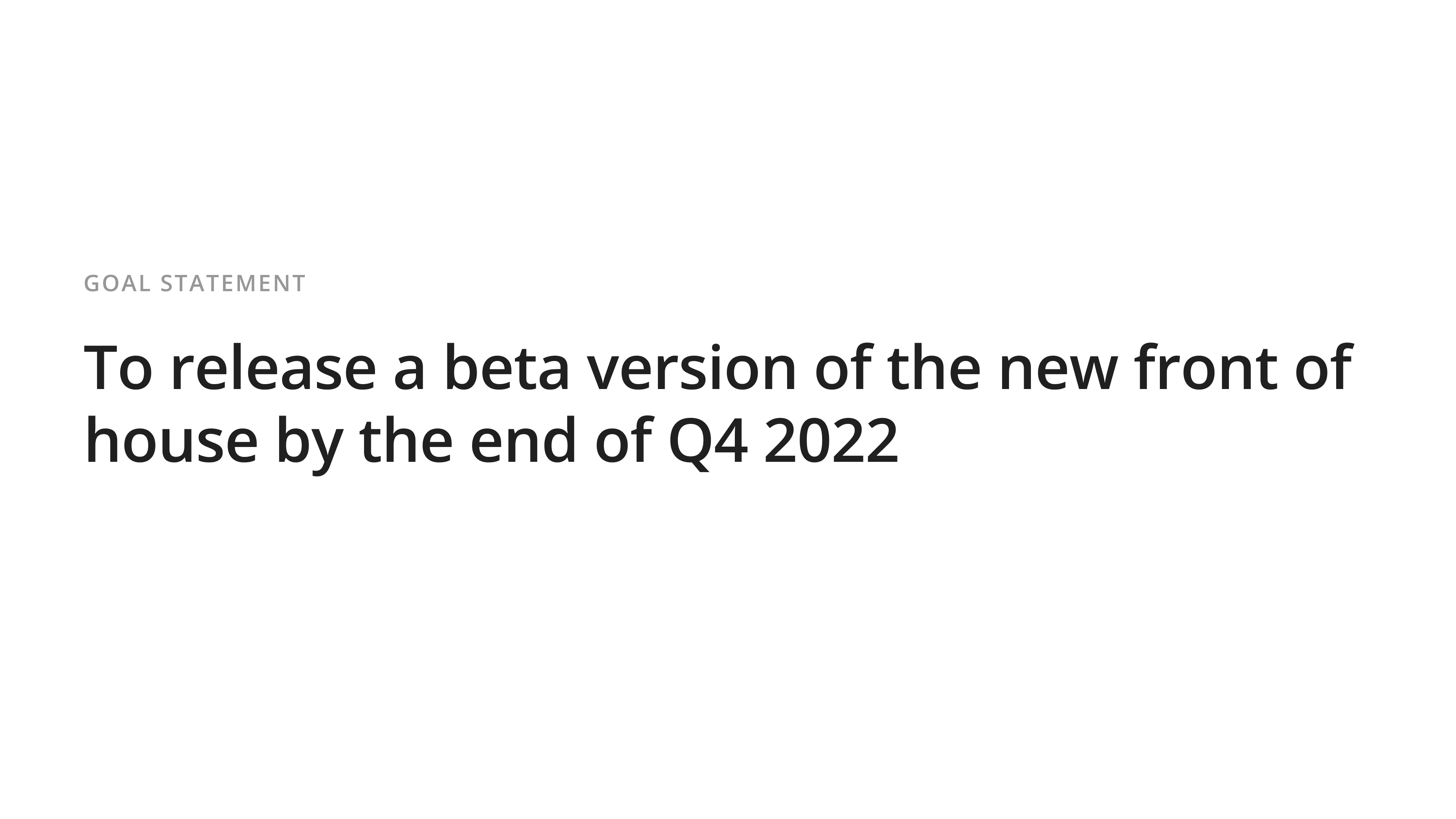
Goal Statement
Once we had the scope of the project identified we came up with a goal statment to reflect our target within the time frame.
Defining Success
We established clear success criteria prior to launch:
- Adoption: Engage 50 salons in our "front of house" beta program for real-world testing and feedback.
- Accessibility and Usability: Prioritise improvements in these areas for key user flows, balancing efficiency with addressing known pain points.
- User Feedback: Gather qualitative insights to guide ongoing development and ensure a positive user experience.
- Development Process: Increase the speed and frequency of iterations, demonstrating the agility of the new web-based platform.
- Timely Release: Launch "front of house" beta by the end of Q4 to maintain momentum.
- Foundational Impact: Successfully migrate a critical user journey from Swing to web, paving the way for a fully modernised platform.
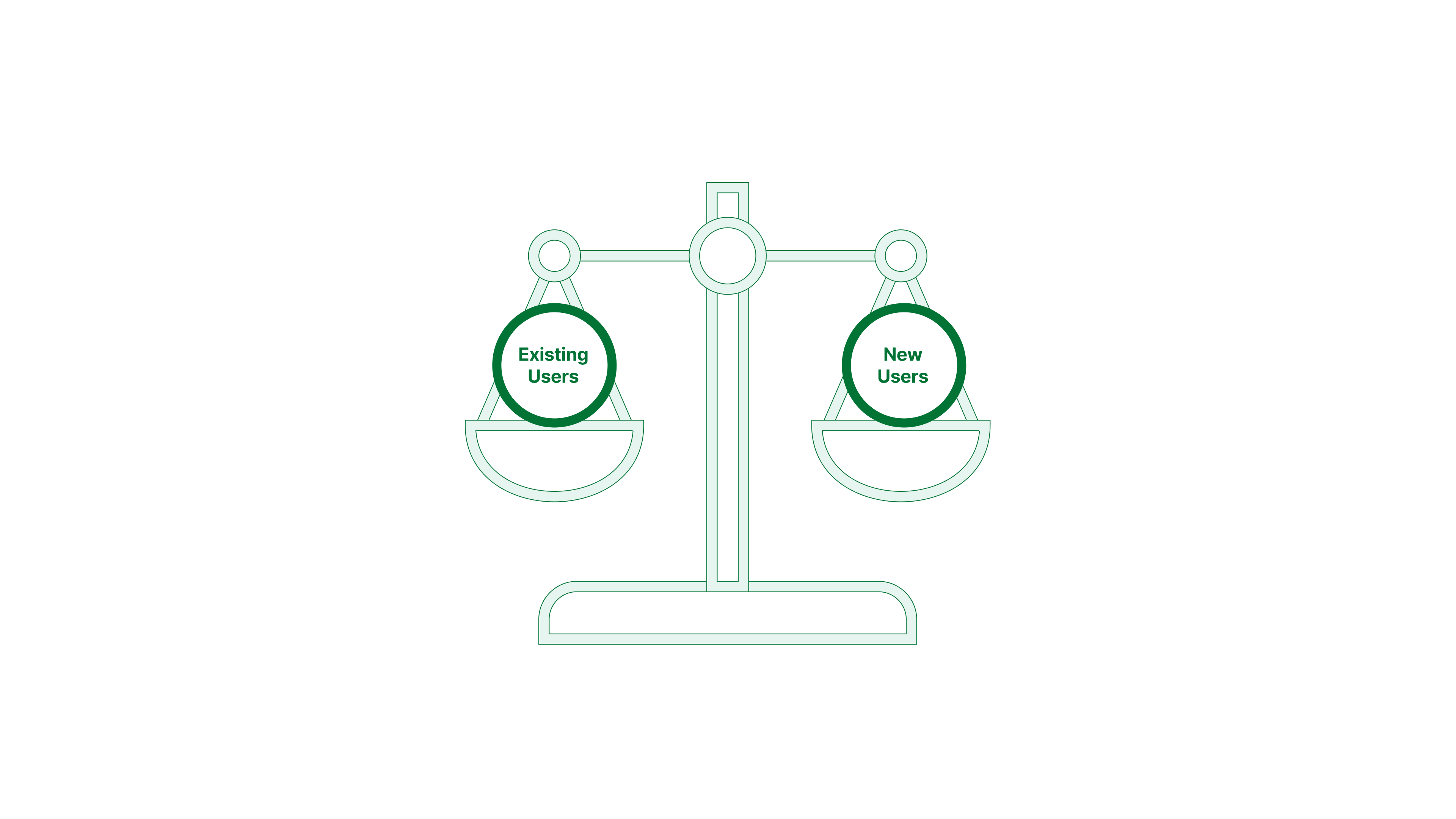
- Understanding User Needs: We recognise the importance of balancing the familiar patterns in our legacy system with enhanced usability. Our goal is to improve existing user journeys while providing a foundation for intuitive onboarding of new clients in the future.
Exploration
What we set out to learn
Our initial goal was to identify existing strengths within the product while pinpointing areas for improvement. This would ensure we retain what works and strategically address pain points in the new Front of House (FOH). Upgrading FOH's capabilities would provide a compelling incentive for users to adopt the new web-based experience.
We employed a multi-faceted approach to derive insights for the Front of House redesign:
Understand
Booking Flow Review
Issues Identified;
- Overwhelming information on the appointment modal
- Unclear how to search through categories of services
- Lack of system feedback, when saved or when exited during the process
- Cluttered UI, inconsistent button and icon styles
- Siloed information related to clients i.e. booking history
Payment Flow Review
Issues Identified;
- Overwhelming information on the appointment summary
- difficulty scanning and digesting information
- inconsistent styles of system feedback
- Cluttered UI, inconsistent button and icon styles
Appointment Calendar Audit
Issues Identified;
- Difficulty scanning information
- Inconsistent icon styling
- Inconstant button styles
Cart & Payment Screen Audit
Issues Identified;
- Difficulty scanning information
- Inconsistent icon styling
- Inconstant button styles
- Unclear interactions on the payment panel
- Expected behaviour is inconsistent
- Increased cognitive load
Client Details Page Audit
Issues Identified;
- Clunky and difficult to scan information
- Inconsistent icon styling
- Inconstant button styles
- Unclear why some information is needed
- Increased cognitive load
Constraint of limited Analytics
The lack of reliable analytics, and in some cases a complete absence of data, posed a constraint on understanding real-world usage patterns within the legacy Swing screens.
In-depth Obervation with Salon Visits
To overcome this challenge, we conducted in-salon diary studies. This involved directly observing and recording how the product was used within its natural environment, providing valuable insights into user behaviours and pain points. What we uncovered was extremely valuable;
- Distracting environment: We learnt that the environment can be very busy distracting, noisy hairdryers, phones ringing, clients coming and going
- Lighting conditions: Lighting conditions vary from different salons some are very bright and other can be quiet dark
- Screen Resolutions: A wide rang of Screen sizes and resolutions and devices
- Touch Screens: Receptionist often had only one hand available and use the touch screen actions the most
- Multitasking: multitasking is quite common with answering the phone, booking a client in and then needed to check a client out.
- Feature hacks: A lot of hacks that the staff knew to get the product to work in a way that they wanted eg. waitlist and to-do items and other notes
Synthesis
Key Issues identified
Our research uncovered critical issues that were hindering user experience and limiting product potential.
- Visual hierarchy: Messy visual hierarchy (alignment, different component heights)
- Clunky scanning UX: Inconsistent visual hierarchy and Forms in multiple columns.
- Inconsistent IxD: Inconsistent Button styles and interactive elements not behaving in expected behaviour
- Siloed Information: Unable to edit and discover certain client information within the booking flow
- System feedback: Lack of and inconsistent visual affordances and system feedback components.
- Information overload: multi-step processes all in one modal, increasing cognitive load.
Design Experiments That Didn't work
We iterated on various visual approaches for our modernised web app, seeking a design that best served user needs. Initially, we tested a version influenced by modern SaaS products.
Why it didn't work
This approach faced challenges during both remote and in-salon usability testing.
- Accessibility emerged as a significant concern, with reduced readability on various salon monitors.
- The toned-down colour palette increased cognitive load in a busy, distracting environment.
- A majority of our users also expressed a strong preference for the familiar Phorest colour scheme.
Importantly, Other key research revealed that over 60% of individuals within the salon and beauty industry in the UK and Ireland have some form of dyslexia. This finding underscores the need for a clear, highly readable design that prioritises both aesthetics and usability for all users.
We did acknowledge the potential value of offering themes in the future to cater to different salon styles and preferences. However, considering the usability challenges faced with the initial modern UI and the focus on core functionality for this phase of the project, theming was ultimately backlogged for further exploration.
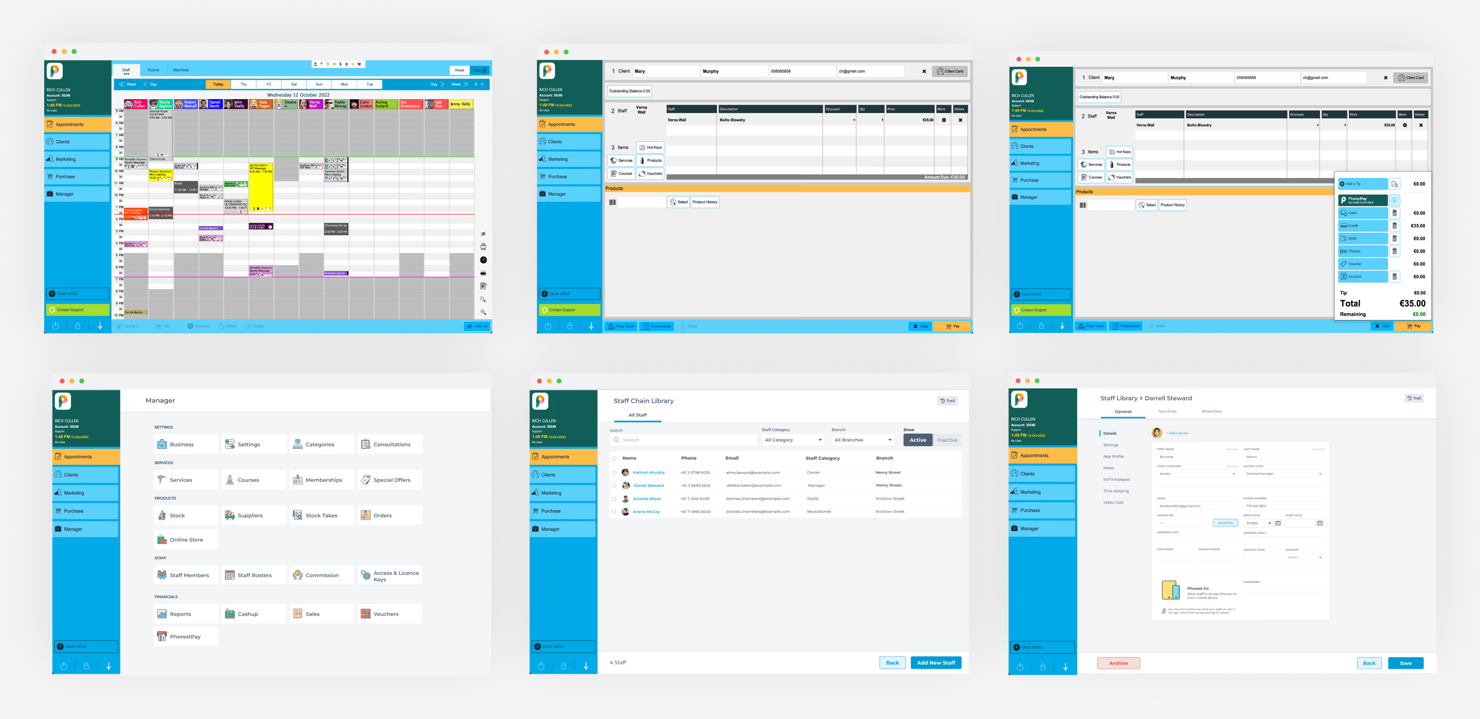
Designs
Appointment Calendar Before & After
Improvements
- Cleaner more readable appointment calendar
- Consistent button styling
- Disabled button states
- Tooltip on slide panel buttons
- Consistent icon styling
- Button sizes easier to click
Cart Before & After
Improvements
- Easier to Scan
- Visual hierarchy fixes
- Consistent button styling
- Editable buttons are clearer
- Button sizes easier to click
- Consistent icon styling
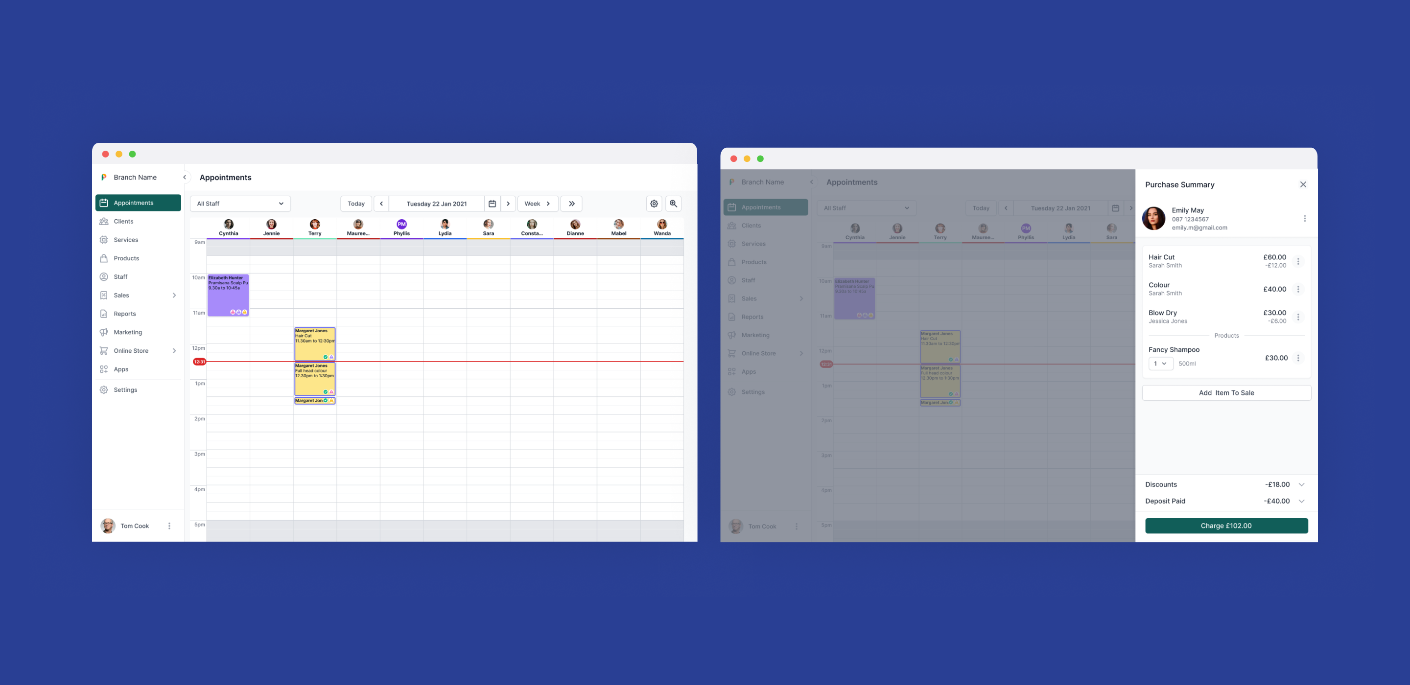
Payment Panel Before & After
Improvements
- Using the space more effectively more room to show different payment methods
- Visual hierarchy fixes
- Consistent button styling
- Editable areas are clearer
- Button sizes easier to click
Client Details Page Before & After
Improvements
- Easier to scan - status tags and form layout
- Visual hierarchy fixes
- Consistent styling
- Sections spaced out more logically and categorised
- Editable areas are clearer
- helpful information added into each section
System Feedback Improvements
In the booking flow there was a lack of system feedback for example choosing an unqualified staff member for a particular service. There was also inconsistencies with the style of the system feedback throughout the product. Below are some examples of the refined system feedback modals which were then added to our design system to be reused throughout our product.
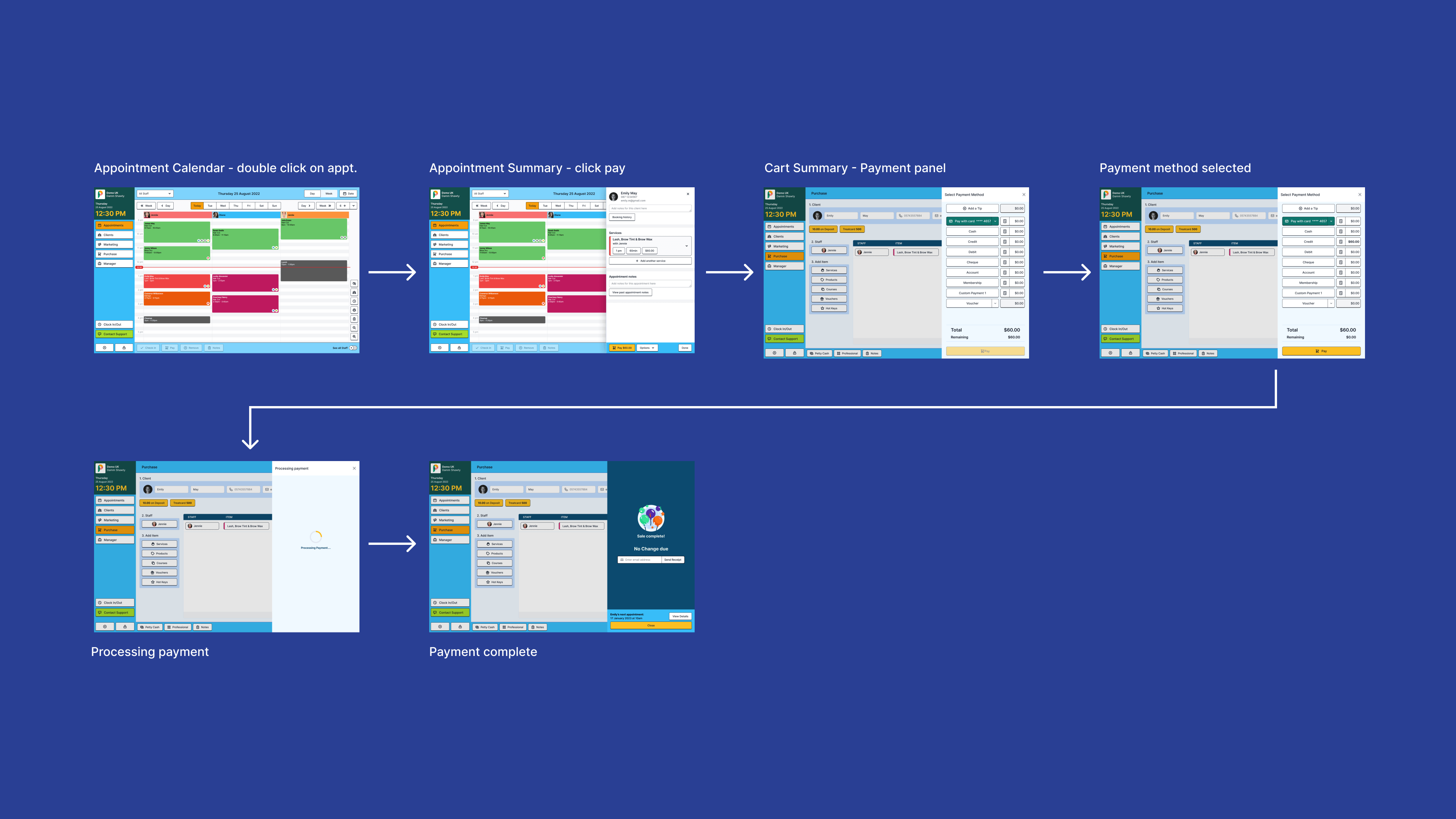
Booking Flow with new designs
Payment Flow with new designs
Project Impact
The project had a lot of positive impact for our business and customers;
- Successfully release our Beta in Q4: First Beta group used our new front of house, providing us continued feedback
- Increase the speed of development and releases: Went from rarely updating the appointment calendar to being about to release feature updates and improvements weekly
- Increase the consistency of our visual language to reduce re-work in both design and development: Our design system was updated with our new components that were aligned on our new visual language
- Improve usability issues on the booking flow: Created a more streamlined booking flow by removing complicated and inconsistent UI
- Delivered a project that successfully implemented the design system which showcases all benefits of our improved processes: Delivered a proven plan to pave the way to fully migrate off the old technology swing, with the following year celebrating more areas deprecating swing.
- Move a critical user journey off of Swing and on the Web: Successfully moved the critical user journey off of Swing


